Reconciling the assumptions that underpin safe withdrawal rate studies with one’s own capital market expectations and constraints is a daunting task, since those studies rarely reflect the practical realities of an advisory practice. But new research now provides a generalized framework for determining a safe withdrawal rate for a given retirement duration, acceptable failure probability, asset allocation and capital market expectations. Advisors no longer must be constrained by the assumptions and choices of others.
I presented this research in my article, Capital Market Expectations, Asset Allocation, and Safe Withdrawal Rates, which was published in the January 2012 Journal of Financial Planning.
The do-it-yourself approach
Most researchers use one set of capital market expectations to study aspects of safe withdrawal rates. Often, they decide to base their analyses on US historical data since 1926. But that is far from a perfect solution. When determining a forward-looking safe withdrawal rate, what matters are our expectations about future market returns as driven by their underlying components: income, growth, and changes in valuation multiples. For instance, the average historical bond return may be of little relevance if current bond yields are at historic lows.
Not all research is based on the historical averages. Sometimes researchers use different assumptions, either because they wish to illustrate a particular concept with basic assumptions, or because they have incorporated their own capital market expectations.
But a general problem remains: Safe withdrawal rates research leaves unanswered questions about what would happen if different asset classes are included, or if different assumptions are made about returns, volatilities, and correlations. My research generalized the framework for safe withdrawal rates, presenting a structure that incorporates user-specified capital market and retirement assumptions.
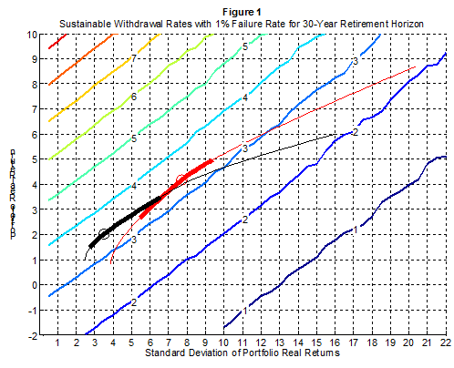
Accompanying the article, I created a series of graphs at my blog. I used Monte Carlo simulations to calculate the combinations of real portfolio arithmetic returns and volatilities that would support different withdrawal rates for various retirement durations and acceptable failure probabilities.
From here, it is a matter of determining the portfolio’s expected return and volatility based on one’s assumptions about asset classes and their expected returns, volatilities, and correlations. In order to find the optimal asset allocation, these assumptions can be transformed into an efficient frontier. Overlaying the efficient frontier onto my figures lets you find the point corresponding to the highest maximum sustainable withdrawal rate. The asset allocation for the optimal point can then be determined separately from the underlying efficient frontier characteristics.
You have now found your recommended withdrawal rate and recommended asset allocation for your own specifications.
The article also describes a secondary finding of my research: Often there are a wide range of asset allocations that support withdrawal rates nearly as high as the optimal asset allocation. Many retirees will be able to support a withdrawal rate within 0.1 percentage points of the optimum with a markedly lower stock allocation. Conservative retirees need not be pressured into uncomfortably aggressive asset allocations, such as the recommendations for 50-75% stocks found in prominent research articles by William Bengen and others.
Putnam Institute study of safe withdrawal rates
A good case study to illustrate how my approach works was provided with W. Van Harlow's June 2011 research for the Putnam Institute, Optimal Asset Allocation in Retirement: A Downside Risk Perspective. The article made headlines last summer for its conclusion that the optimal stock allocation for retirees is 5-25%, basing these surprisingly low stock allocations on downside risk measures that emphasized the magnitude of failure.
I was puzzled by a footnote of Harlow’s, however, which indicated that when he tried a fixed 30-year retirement period, he found that the optimal asset allocation is 12% stocks, 31% bonds, and 57% cash. I did not replicate his downside risk measures, but these asset allocations are uncharacteristically conservative and cash heavy, even if one accepts only a 1% failure probability (which doesn’t leave much of a downside to minimize).
What really drives Harlow’s results are his capital market assumptions, rather than his downside risk measures. His study cannot be directly compared to existing research, because his assumptions are more pessimistic for stocks and more optimistic for bonds and cash. Table 1 shows the summary statistics for the historical data, as well as Harlow’s assumptions.
Table 1
Summary Statistics for U.S. Real Returns Data, 1926 – 2010 |
|
|
|
Correlation Coefficients |
|
Arithmetic
Means |
Standard Deviations |
Stocks |
Bonds |
Bills |
Stocks |
8.70% |
20.39% |
1 |
0.08 |
0.09 |
Bonds |
2.52% |
6.84% |
0.08 |
1 |
0.71 |
Bills |
0.69% |
3.90% |
0.09 |
0.71 |
1 |
Source: Own calculations from Stocks, Bonds, Bills, and Inflation data provided by Morningstar and Ibbotson Associates. The U.S. S&P 500 index represents the stock market and the intermediate-term U.S. government bond index represents the bond market. |
|
Real Asset Return Assumptions from Harlow (2011) |
|
|
|
Correlation Coefficients |
|
Arithmetic
Means |
Standard Deviations |
Stocks |
Bonds |
Bills |
Stocks |
6% |
16% |
1 |
0.20 |
0.15 |
Bonds |
3% |
7% |
0.20 |
1 |
0.35 |
Bills |
1% |
2.5% |
0.15 |
0.35 |
1 |
To assess the importance of these different capital market expectations, I computed an efficient frontier for each set of assumptions. In figure 1, I overlaid these efficient frontiers (red for the historical data, black for the Harlow assumptions) onto the safe withdrawal rates for a 30-year retirement duration and a 1% acceptable failure probability. Each diagonal line (technically an “isoquant”) shows the combination of rates-of-return and standard deviations that will produce a given safe withdrawal rate.
The thin parts of the curves identify the entire efficient frontier of asset allocations. The circles identify the points reaching to the highest sustainable withdrawal rate. The thick parts of the curves identify the range of portfolio allocations supporting withdrawal rates within 0.1 percentage points of the maximum. For the Harlow case (black), the optimal asset allocation supports a 3.5% withdrawal rate over 30 years with a 1% chance for failure, while the historical data (red) supports a 3.4% withdrawal rate. Though these different assumptions result in similar withdrawal rates, the optimal asset allocations are not close.

The figure does not directly show the asset allocations. For those, we have to return to the software identifying the points on the efficient frontier. With Harlow’s assumptions, an asset allocation of 11/24/65 for stocks/bonds/cash is optimal in terms of supporting the highest withdrawal rate. This is fairly close to the allocation identified in Harlow’s footnote (12/31/57).
Meanwhile, results for the typical safe withdrawal rate study based on historical data are represented by the red curve. In this case, the optimal allocation is 27/73/0 for stocks/bonds/bills. The stock allocation is noticeably higher despite this retiree’s conservative requirement of accepting a maximum 1% failure rate.
This example illustrates how the framework for incorporating one’s own capital market expectations works, and it also shows that much of the lower stock allocations identified in Harlow’s research can be explained by his different capital market expectations, not by his different methodology.
The difficulties of developing capital market expectations
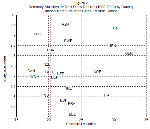
Of course, formulating appropriate capital market expectations is hard. A particularly important issue is volatility. A common expectation is that future stock returns will be lower than their historical averages. But what about stock market volatility? Would lower stock returns be accompanied by lower volatility, or is it reasonable to keep volatility the same? Or, might we even expect volatility to increase? After all, figure 2 shows that from an international perspective, US stock returns have been relatively high while volatility has been relatively low.
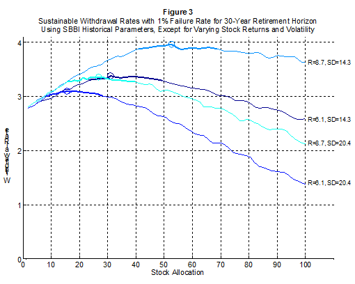
Because the withdrawal rate lines in figure 1 are upward sloping, pinpointing the precise combination of expected returns and volatilities is important; if you forecast lower volatility, you can use a less aggressive asset allocation to obtain the same withdrawal rate. This is illustrated further in figure 3, which uses the historical data parameters, except it assumes that either the real stock return or stock volatility decrease by 30%, if not both. With the 30-year horizon and 1% failure rate, the baseline historical assumptions result in a 3.4% sustainable withdrawal rate with 27% stocks. If both the returns and volatility simultaneously drop by 30%, the impact is negligible. The safe withdrawal rate remains about the same and the optimal stock allocation increases slightly. But if returns drop while volatility stays the same, both the withdrawal rate and optimal stock allocation decline. If only the volatility were to decrease, a 50% stock allocation could support a withdrawal rate of nearly 4%.
The bottom line
Safe withdrawal rates are connected in vitally important ways to underlying asset class choices and return characteristics. My new research provides a framework for connecting these pieces together, letting planners move beyond the confines of existing research assumptions.
Wade Pfau, Ph.D., CFA, is an associate professor of economics at the National Graduate Institute for Policy Studies (GRIPS) in Tokyo, Japan. He maintains a blog about retirement planning research at wpfau.blogspot.com
Read more articles by Wade Pfau