You put on your best outfit for client and marketing meetings. Your offices are well-appointed, reflecting the
professional culture of your firm. Then you pass the presentation materials around. The colors are clichéd
and difficult to read. With the flip of a page, you’ve lost your chance of making a positive first impression.
Your client reports and marketing presentations are arguably the most public face of your practice. How they look
and the colors you choose affect the way clients and prospects respond to the information you want to convey.
Color communicates information even before we begin to read the content. Leatrice Eiseman, a highly regarded color
expert, notes that color adds meaning to communication, and this becomes even more important when words are not
used, as in financial charts and reports. A recent study at UC Berkeley found that visual communication via charts
is fundamental to the process of disseminating information. Because humans have a facility for understanding visual
information, well-designed charts and other diagrams help audiences quickly understand complex ideas. Eiseman also
notes that each color family conveys moods and associations that can become part of the message. Advisors can
harness the power of color to engage their audience and more effectively communicate with them.
Here are seven strategies for choosing colors that reflect a positive brand image and lend credibility to your
message.
-
Understand warm and cool colors
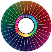
People perceive blue, green and violets as cool, and red, orange and yellows as warm. Cool colors and warm
colors are related to a universal human experience – possibly due to our association of ice and deep
water with cold and fire and the sun with heat.
Warm colors are energetic and demand attention. You can use red or red-orange with a white background to
attract the eye and provide a focal point for your report or presentations. But a little goes a long way, so
be careful. Given the context, too many reds and oranges may be perceived as aggressive – and, of
course, “in the red” has financial and investment performance connotations most advisors would
rather avoid!
Conversely, cool blues are perceived as reserved, calm and secure. As cool colors become brighter –
such as turquoise – they show less restraint. Changing the undertone of a color can alter its
temperature; the redder a purple, the hotter it gets. Yellow-greens are earthier and warmer than the
blue-greens of deep water, which are perceived as cool and clean.
Identify the intended effect of the color: Do you want to convey reliability or dynamic energy? Use dark
blues and greens to create a mood of reassurance and conservative associations of security. Use warm colors
to create vibrancy or emphasis in a report.
-
Be client-centered.
The right colors will reflect your brand and elicit a favorable emotional response from clients. A common
mistake is to select colors based on personal preferences. What if your favorite color is magenta? It may
convey frivolity – something best avoided when presenting a client report!
Design experts talk about colors in terms of being “modern,” “moderate” and “conservative,”
based on how much black goes into its making. Brighter colors tend to be more modern, while darker colors
tend to be more conservative.
For example, an advisor with a niche practice that targets McDonald’s franchise owners might select a
color palette with brighter primary colors, which will feel familiar to them based on their own brand
palette. An advisor who focuses on physicians and their families, on the other hand, might find that darker,
more conservative hues resonate better with their clients.
There’s no right or wrong here. Providing financial and investment advice is serious business, but
that doesn’t mean that all advisors should use conservative colors. Understand your brand and your
audience, and select a palette that works best for your practice.
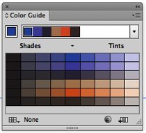
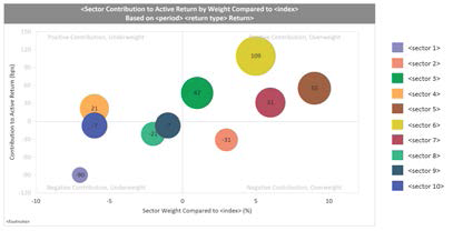
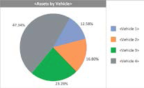
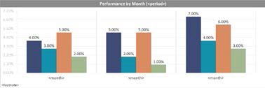
Figures 2a, b and c, illustrate modern, moderate and conservative color choices, and how you could use them
in client reporting and marketing presentations.
Figure 2a. Modern colors: Brightest, bold, energetic

Source: assette.com
Figure 2b. Moderate colors: Less bright, reassuring
Source: assette.com
Figure 2c. Conservative colors: Darker, traditional, serious
Source: assette.com
-
Be contemporary
Colors, like everything else, go in and out of style, so update tired palettes. To project a conservative
image, try a contemporary take on a darkish color. The hunter green and cranberry red favored by advisory
firms in 1980s once projected stability and traditional values. Today, it’s more likely to say “old
school.”
But switch that cranberry to Marsala, Pantone’s Color of Year in 2015, and you’ve jumped into
the 21st century without making a dramatic shift in your brand identity.
And if leading edge is your thing, then a bright color like Emerald, PANTONE 15-5641, is a good substitute
for that hunter green.
Putting it all together
The colors you use in client reports reinforce the information you want to convey. When you follow these objective
strategies for choosing and using color, you will create materials that will resonate with your clients. A
well-chosen color palette showcases your message and helps your firm stand out in a crowded field of competitors.
This article is adapted from the paper “First
Impressions Matter: The Importance of Color in Investment Management Presentations and Reporting,”
written in collaboration with Assette. The next article will focus on the
2nd pillar of a standout presentation: how the font you choose – and how you use it – can be as
powerful as the words it forms.
Joyce Walsh is a professor at Boston University College of Communication. With academic and professional
backgrounds in both the arts and technology, her work has been featured in publications, exhibitions and
corporate art collections around the world. Her book, “Graphic Design Essentials: Skills, Software and
Creative Strategies,” was the first book to combine design fundamentals with creative software
skills.
Read more articles by Joyce Walsh