BLS Jobs Report Is Broken. Is There A Better Measure?
Membership required
Membership is now required to use this feature. To learn more:
View Membership Benefits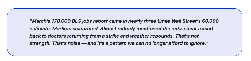
Every time we see the release of the BLS jobs report, there are always problems with it. Over the years, I’ve come to accept that most government statistics are imperfect. Regardless, they are what markets pay attention to. However, it is increasingly clear that the BLS Jobs report over the last three years has been problematic. That report lands on the first Friday of every month and sends equity futures swinging before markets open. The problem is that the report has become so distorted by sampling failures, model-based imputations, and seasonal adjustments layered on top of more seasonal adjustments that the monthly print often tells us almost nothing reliable about the actual state of employment.
I realize that is a serious claim that borders on heresy, but let me back it up with the data. I want to show you what I believe is a simpler, more honest alternative. One that filters out the noise and reveals the employment trend that matters to investors and policymakers alike.
Let’s start with the March BLS jobs report.
Read more: A Tale of Two Tapes
March 2026: A Beat That Wasn’t What It Seemed
The March employment report showed 178,000 nonfarm payrolls added in the US economy. That was against a Wall Street consensus estimate of just 60,000. How did analysts get it so wrong? But here’s what you need to understand about what’s actually inside that number.
Healthcare alone contributed 76,000 jobs, the single largest sector gain in the entire report. The BLS explicitly noted that offices of physicians added 35,000 workers as striking Kaiser Permanente nurses and physicians in California and Hawaii returned to work. That’s not organic job creation; that’s the statistical reversal of a prior negative. Construction added 26,000 jobs following weather-related losses in January and February. Transportation and warehousing contributed 21,000. Strip out those three mechanical rebounds, and you’re looking at a print far closer to the underlying trend.
Meanwhile, federal government employment fell another 18,000 in March, extending an aggregate decline of 355,000 jobs, roughly 11.8%, since October 2024. Financial activities shed 15,000 more, now down 77,000 from its May 2025 peak. February was revised sharply downward, from a reported decline of 92,000 to an actual decline of 133,000. January was nudged upward from 126,000 to 160,000.
So, what does that mean? The net job creation across the two months was negative 7,000. The prior two months were weaker than initially reported. Notably, March’s strength was largely a rebound from mechanically depressed prior readings.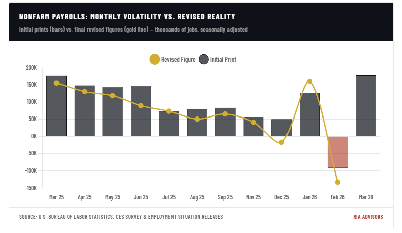
That pattern of wild initial swings followed by quiet downward revisions isn’t unique to this cycle. It’s a structural feature of the methodology itself. There are three main reasons for it:
- The sampling problem,
- The Birth-Death model, and
- The seasonal adjustment framework
The credibility of any single monthly print becomes very difficult to defend because of these issues.
Three Structural Flaws In Every Monthly BLS Jobs Report
Let’s start with the “sampling problem.”
The BLS jobs report starts with an establishment survey that currently samples approximately 119,000 businesses and government agencies, covering about 622,000 individual worksites. That sounds comprehensive until you learn that this represents roughly just 26% of all nonfarm payroll jobs in the United States. The BLS extrapolates the remaining 74% using statistical modeling. Furthermore, first-closing response rates, the data forming the basis for the initial monthly print, have slipped from roughly 70% before the pandemic to around 60% today, according to Michael Horrigan, a former 33-year BLS veteran now at the Upjohn Institute for Employment Research.
What that means practically is that the jobs number the financial press reports as “established fact” on the first Friday of every month is based on roughly 60% of a survey that covers only 26% of total employment. The remaining data gets filled in over the next two monthly revisions as additional survey responses come in, with 90% coverage by the second close, and 95% by the third. This is why the data is constantly revised after the first job’s print. These are not adjustments, but rather actual data arriving after the markets have already moved on an estimate.
That leads us to the second problem: the “birth-death adjustment.”
Because the BLS cannot survey businesses that don’t yet exist or immediately identify businesses that have closed, it fills that gap with a model called the Birth-Death model. The concept is straightforward: estimate the net employment effect of new business formations and closures using historical patterns from the Quarterly Census of Employment and Wages. There is nothing wrong with the idea. The execution is the problem, which has grown substantially worse in recent years.
The QCEW data used to feed the Birth-Death model runs 6 to 9 months behind the current reference period. The BLS is forecasting current business births and deaths using information about conditions from more than half a year ago. In a stable, slowly evolving economy, that lag might be manageable. In an economy undergoing rapid structural shifts, such as pandemic-driven business formation, tariff-driven disruptions, and federal workforce reductions, the model fails in predictable ways. Fed Chair Jerome Powell acknowledged this directly in a press conference following the August 2025 benchmark revision, noting there had been an “almost predictable overcount” of jobs in recent quarters stemming from Birth-Death model errors.
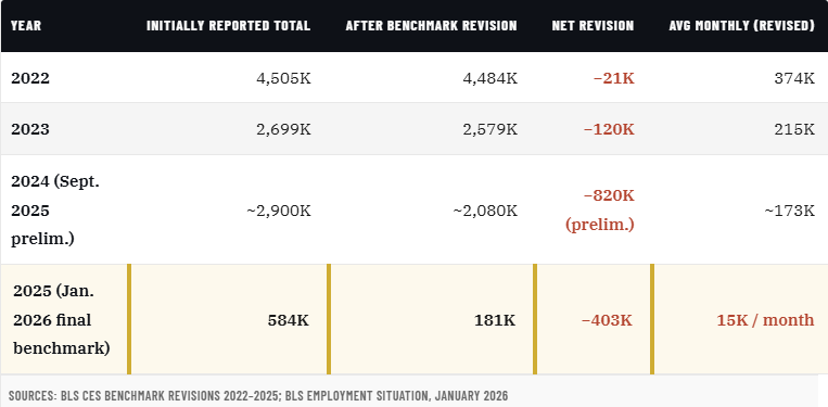
The consequences of that failure are not small. The preliminary benchmark revision for March 2025 showed the BLS had overstated nonfarm employment by 911,000 jobs over the prior twelve months. When the annual benchmark process was finalized with the January 2026 release, the full-year 2025 employment change was revised from an initially reported +584,000 to just +181,000, a reduction of 403,000 positions. That means the average monthly payroll gain for all of 2025 was approximately 15,000 jobs after revisions, compared to the 48,000 the real-time reports had been signaling. For most of 2025, the financial media reported a labor market roughly three times stronger than the actual data later confirmed.
Three consecutive years of overestimation, each requiring a downward correction at benchmark time. The BLS acknowledged the pattern explicitly, for three years running, the establishment survey overstated job creation and required downward revision. Erica Groshen, a former BLS Commissioner, pointed to a structural explanation: the post-pandemic surge in business formations populated the economy with smaller, more marginal firms that were more likely to fail quickly than the historical patterns on which the model was calibrated. The model counted those births as durable job creation. They weren’t.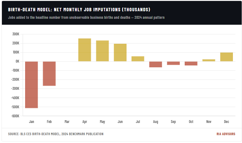
Notice what this chart reveals. The Birth-Death model subtracts a substantial number of jobs from the January headline, roughly 514,000 net, because the seasonal pattern calls for business deaths to dominate in that month. Then it adds hundreds of thousands back from April through June, the period when new business formation historically peaks. This means a significant portion of the spring “hiring surge” that markets celebrate each year is not actually hiring. It’s a model-generated imputation based on patterns that, as we’ve now confirmed through three years of benchmark corrections, have materially overstated reality.
Lastly, there are the “seasonal adjustments” to correct distortions that no longer exist.
Seasonal adjustments are conceptually sound. The purpose is to strip out recurring calendar effects, like holiday hiring and summer construction, to expose the underlying trend. The problem is that the COVID pandemic fundamentally broke the seasonal patterns the X-13 ARIMA-SEATS algorithm uses as its baseline. The model requires historical data for calibration. Therefore, when the prior three to five years include a pandemic lockdown, a fiscal-stimulus-fueled hiring explosion, a post-pandemic normalizing surge, and a federal government shutdown that eliminated an entire month of data collection (October 2025), the seasonal “expectations” baked into the model no longer represent any recurring real-world pattern.
The Federal Reserve Bank of Dallas identified a specific version of this problem. When the benchmarked and non-benchmarked data are combined into a single series and then seasonally adjusted together, the algorithm overestimates the negative seasonal factor in certain transition months. This produces artificial jumps in adjusted employment that partially reverse in subsequent months. Here is the thing: this is a known technical issue within the methodology, and it directly contributes to the volatility we’ve observed in monthly prints over the past two years. Seasonal adjustments are compounding the distortions introduced by the Birth-Death model rather than correcting for them.
A Better Measure: The 12-Month Household Survey Average
I understand that the individuals producing the BLS jobs report are smart. However, there is a method I find genuinely useful. Furthermore, there is a growing number of serious economists and strategists who have been arguing the same. The Current Population Survey, known as the household survey, is a separate instrument that interviews approximately 60,000 households each month. It measures employment completely differently from the establishment survey, by counting people rather than jobs. It includes self-employed workers, agricultural workers, unpaid family workers, and gig economy participants that the payroll survey entirely excludes. Each employed person is counted once, even if that person holds multiple jobs, where the establishment survey would count them separately on each payroll.
However, the household survey has a very real limitation I’ll acknowledge directly: its month-to-month sampling error is large. The BLS states it requires an over-the-month change of about 650,000 to reach statistical significance in the household survey, compared with roughly 122,000 in the establishment survey. A single month of household survey data is nearly useless as a real-time indicator. But that’s precisely the point. You shouldn’t be calibrating investment theses to a single month of data from either survey. The single-month establishment survey number we collectively obsess over is a rough draft. That “draft” has been revised downward by hundreds of thousands of jobs in each of the past three annual benchmark cycles.
What resolves the household survey’s volatility problem is the same tool that resolves the establishment survey’s revision problem: averaging across a longer window. A 12-month rolling average of household survey employment changes smooths sampling noise, eliminates the seasonal adjustment distortions that plague payroll data, sidesteps the Birth-Death model entirely, and produces a trend line that doesn’t get substantially revised away a year later. It measures what actually happened to actual people across a full year of data, and it’s not subject to the backward restatement risk that has now repriced three consecutive years of establishment survey history.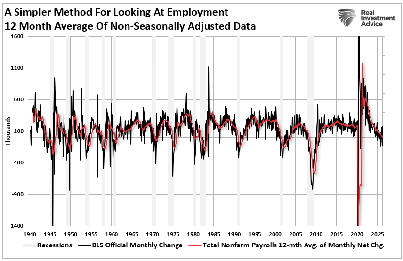
The raw monthly household survey numbers are erratic. As shown, they can swing several hundred thousand in a single month. These swings are common and convey no useful information about the trend. But the 12-month rolling average presents a coherent, readable picture of employment momentum. What that picture has shown over the past two years is a labor market that has been clearly and consistently decelerating, a trend the nonfarm payroll headline number consistently overstated, confirming the weakness only through downward revisions well after the fact.
This approach also has historical credibility. As researchers at Econbrowser have noted for years, the household survey tends to lead the payroll survey at economic turning points, precisely because it doesn’t depend on the Birth-Death model’s lagged business formation data. When the economy actually turns, the household survey’s trend tends to capture it first. The payroll survey catches up when the benchmarks arrive.
The Counterargument And Why It Doesn’t Hold Up
The standard defense of the nonfarm payroll report is its statistical precision at the point of release. The margin of error is smaller. The industry detail is richer. The sample is larger. All technically true in isolation. What that argument ignores is that statistical significance at publication becomes irrelevant if the BLS revises the number by 400,000 to 900,000 at benchmark time. Precision on a wrong number is worse than a wide confidence interval on a right one. Therefore, if you’re calibrating your portfolio positioning to a figure that has a documented, recurring pattern of overstating job creation by hundreds of thousands of positions annually, it could be problematic.
The second common defense is that revisions are normal and expected. I agree, revisions are normal. But the direction and magnitude of BLS revisions over the past four years have been anything but normal. Three consecutive years of systematic overestimation, each requiring a significant downward benchmark correction, is not a random statistical process. It’s a model calibrated on a world that no longer fully exists.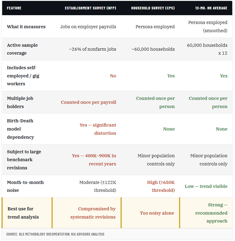
When you apply a 12-month rolling average to the household survey’s monthly employment changes, the picture that emerges is more sobering than the nonfarm payroll headlines have suggested. The trend has been decelerating since mid-2023, with the rolling average settling into a range of roughly 40,000 to 60,000 new employed persons per month, well below the 150,000 to 200,000 range associated with a genuinely healthy labor market absorbing normal labor force growth.
Full-time employment as measured by the household survey has been particularly weak. Part-time and gig work have driven much of the apparent stability in the headline count of employed persons. That’s a meaningful distinction for anyone gauging the actual health of consumer spending capacity and corporate hiring intentions. A worker holding two part-time jobs is counted as one employed person in the household survey, but appears as two separate payroll additions in the establishment survey. In a period where part-time work and multiple job-holding have increased, the establishment survey almost certainly overstates the breadth of labor market strength relative to actual economic participation.
Conclusion
Federal government employment is now the most visible structural drag, with 355,000 positions eliminated since October 2024. This won’t reverse in the near term, and the effects will compound as displaced federal workers cycle through unemployment or shift into the private sector, which is itself absorbing headwinds from tariff uncertainty and tightening financial conditions.
The BLS jobs report, as currently structured and consumed by markets, is producing more noise than signal. The combination of a shrinking active sample, a Birth-Death model running on six-to-nine-month-old data, post-pandemic seasonal distortions that haven’t fully resolved, and three consecutive years of directionally biased overestimation has created a situation where markets are trading on a rough draft that gets substantially rewritten after the fact.
The 12-month rolling average of the household survey isn’t perfect. It lags real-time events. It captures the trend rather than the turning point. I’ll grant every one of those limitations. But perfection isn’t available in economic measurement. The relevant comparison is a noisy, frequently revised, model-dependent estimate versus a smoother, more honest representation of what actually happened to employment over a full year of data. For understanding where the labor market actually stands, as opposed to where the algorithms think it stands at 8:31 a.m. on the first Friday of the month, the household survey average wins on every dimension that matters for longer-term investment decisions.
The simplest argument for this proposed approach is also the most damning for the status quo. When the BLS itself revises 2025’s entire annual job creation figure from 584,000 to 181,000, the question isn’t whether the monthly number is reliable. The question is why we’re still pretending it is.
A message from Advisor Perspectives and VettaFi: Discover something new! Click here to register for our upcoming webcasts.
Lance Roberts is a Chief Portfolio Strategist/Economist for RIA Advisors. He is also the host of “The Lance Roberts Podcast” and Chief Editor of the “Real Investment Advice” website and author of “Real Investment Daily” blog and “Real Investment Report“. Follow Lance on Facebook, Twitter, Linked-In and YouTube Customer Relationship Summary (Form CRS)
Join RIA Advisors and elevate your career within a deeply experienced team focused on innovation. Our collaborative environment is built on a foundation of advanced technology and effective investment models, designed to enhance your ability to serve clients and grow your practice. Benefit from a supportive culture that encourages professional development and fosters a forward-thinking approach. By joining our team, you’ll be part of a group dedicated to excellence and continuous improvement, empowering you to focus on building meaningful client relationships and pursuing your business ambitions. Discover the advantages of working with our accomplished advisory team by starting your conversation today.
Membership required
Membership is now required to use this feature. To learn more:
View Membership Benefits