While every market downturn is unique, history offers a crucial lens for understanding recovery. This chart series provides a comprehensive overlay of the Four Bad Bears in U.S. history since the 1929 peak, comparing their recovery paths through the S&P 500's close on March 31, 2026.
By aligning these historic market peaks, we can analyze the long-term performance of the S&P 500 on a comparable timeline. These charts are not intended as a forecast but rather as a way to study the current market in relation to historic market cycles. The four periods chosen are considered among the worst in history:
- The Crash of 1929: The catalyst for the Great Depression.
- The Oil Embargo of 1973: Followed by a vicious bout of stagflation.
- The Tech Bubble: The 2000 valuation peak and subsequent "lost decade."
- The Financial Crisis: The 2007 peak and the modern era's longest recovery.
We have taken the market peak that occurred before each major decline (shown on each chart) and aligned those four dates to create a single starting point. The x-axis in each chart shows the number of years since the aligned peaks, using an interval of 252 days, which is roughly equivalent to the number of market days in a calendar year. This method allows us to compare where each recovery stood after the exact same amount of time: 4,648 market days (roughly 18.4 years).
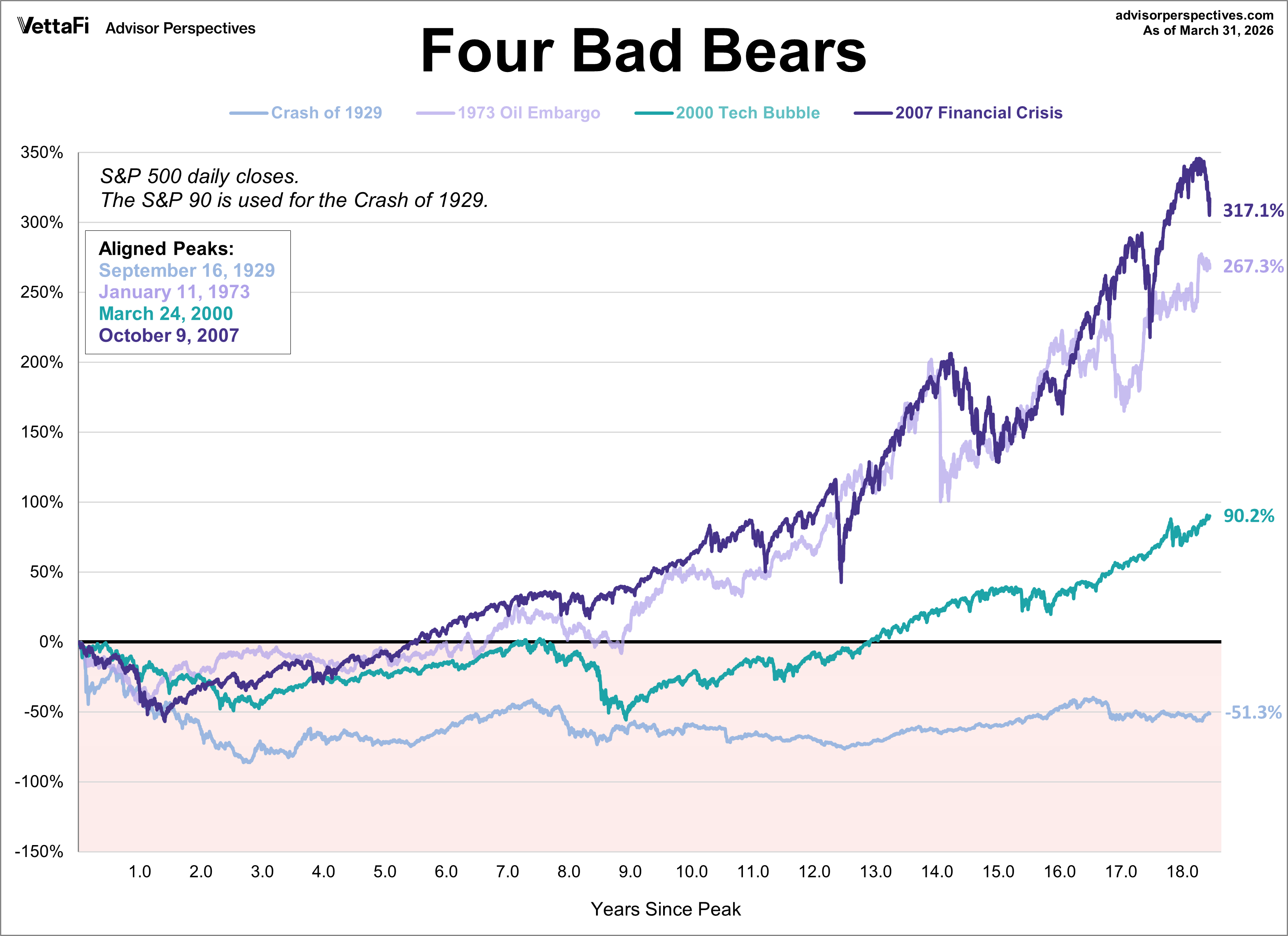
Price Performance: The Nominal View
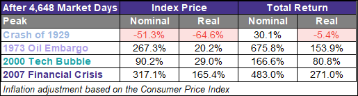
The first chart focuses on price action alone, excluding dividends. At the current mark, the recovery from the 2007 Financial Crisis stands out as the clear leader with a 317.1% gain. In contrast, the recovery from the 1929 Crash remains the laggard, still down 51.3% from its peak at this same point in its timeline.

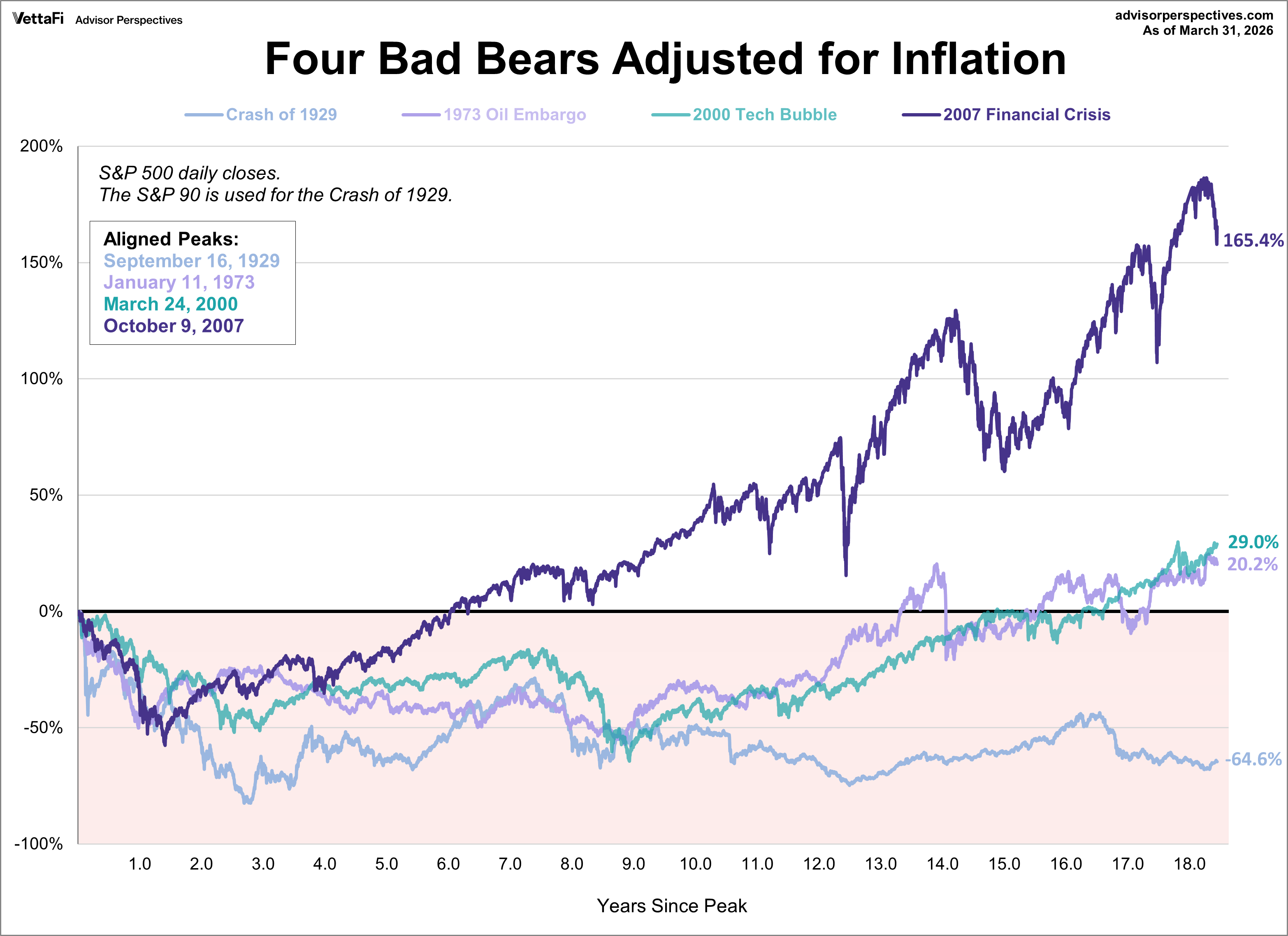
The Inflation-Adjusted Reality: When Gains Disappear
While nominal gains look impressive, they don't account for the eroding power of the dollar. When we adjust for inflation, the "real" story of the 1970s emerges.
The 1973 Oil Embargo recovery, which appeared robust on a nominal basis, is reduced dramatically when adjusted for the stagflation of that era, dropping from a 267.3% nominal gain to a mere 20.2% real gain. Meanwhile, the 2007 recovery maintains its lead due to several years of exceptionally low inflation.
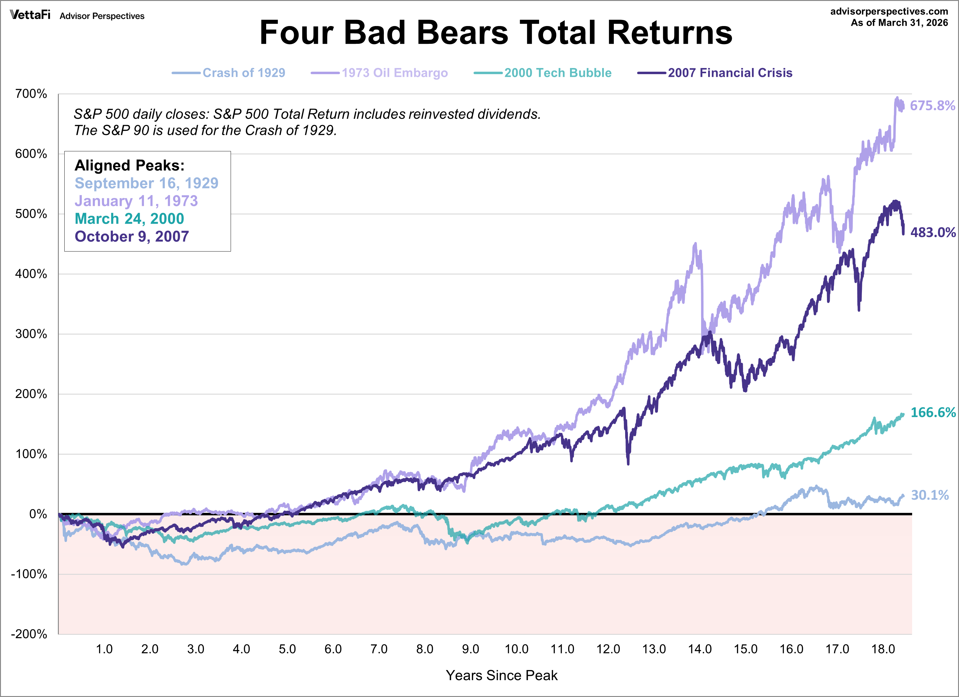
Total Returns: The Engine of Reinvestment
Price movement is only half the story; for most investors, dividends are the primary engine of long-term growth. This chart incorporates reinvested yield on a nominal basis.
When dividends are included, the 1973 recovery actually takes the lead, surging 675.8%. Even the 1929 Crash, which was deeply underwater on a price-only basis, manages to pull into positive territory with a 30.1% total return.
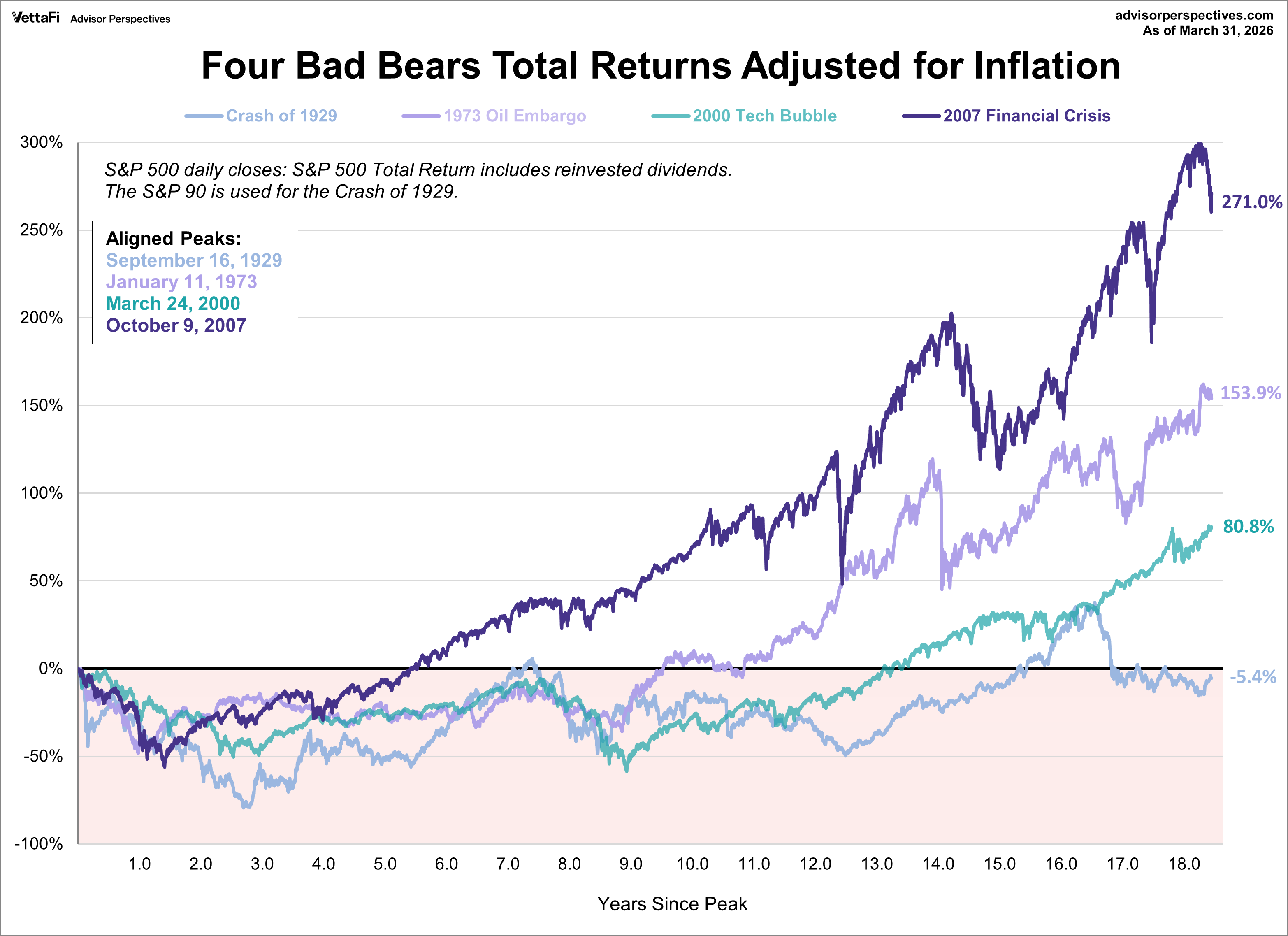
Real Total Returns: The Most Critical Metric
For long-term investors, the real total return is the ultimate benchmark of success, as it measures actual purchasing power growth after accounting for both dividends and inflation.
On this basis, the 2007 Financial Crisis recovery reclaims the top spot, up 271.0%. The impact of inflation on the 1973 era becomes clear, as its massive nominal gains are slashed by the cost of living. Notably, the 1929 recovery remains the only cycle to show negative real total returns (−5.4%), underscoring the unique severity of the Great Depression.
Performance Summary: 4,648 Market Days Later
The following table provides a concise comparison of these four cycles at the equivalent point in their respective histories.
Key Takeaways from the Four Bears
-
Inflation is the "Silent Killer": The 1973 period demonstrates how high inflation can turn a 676% nominal gain into a much more modest 154% real gain.
-
Dividends are Essential: In every cycle except 1929, reinvesting dividends turned a period of market volatility into significant wealth creation. The 2000 Tech Bubble recovery nearly doubled its gains when dividends were included.
-
1929 Remains an Outlier: Even after 18 years, the 1929 cycle is the only one that failed to reclaim its peak on a real price basis, and the only one to produce a negative real total return, underscoring the severity and sustained damage of that economic environment.
As we can see, the same amount of time has resulted in four vastly different economic outcomes, highlighting the difficulty of market forecasting and the importance of focusing on real, total returns.
For a more comprehensive understanding of how these cycles fit into a broader historical context, we offer a long-term perspective on secular bull and bear markets. This view is adjusted for inflation and covers the S&P Composite since 1871.
ETFs associated with the S&P 500 include: iShares Core S&P 500 ETF (IVV), SPDR S&P 500 ETF Trust (SPY), Vanguard S&P 500 ETF (VOO), and SPDR Portfolio S&P 500 ETF (SPLG).
Read more updates by Jen Nash